




Choosing the Right Signage Colour: What Works Best for Different Businesses?
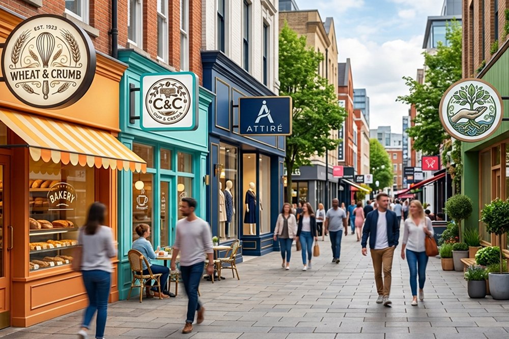
Your business sign is often the first physical interaction customers have with your brand. Before they read your company name, understand your services or scan a QR code, they see a combination of colour, shape, lighting and typography.
That makes signage colour much more than a design preference.
The right colour can help your business appear trustworthy, premium, energetic, welcoming or modern. The wrong combination can make an otherwise well-designed sign difficult to read, blend into its surroundings or look completely different under daylight and artificial lighting.
For businesses in Dubai, colour selection becomes even more important because signage has to perform in bright sunlight, at night and across different environments—from busy retail streets to malls, offices, restaurants and commercial buildings.
So, which signage colour is right for your business?
The answer depends on your brand personality, target customers, location, viewing distance, background, lighting and the type of sign you are producing.
Why Does Signage Colour Matter?
Colour performs several jobs at the same time.
A well-planned signage colour scheme can:
- attract attention from a distance
- strengthen brand recognition
- communicate a particular personality
- improve readability
- create visual hierarchy
- distinguish your business from neighbouring brands
- improve visibility during the day and night
- make your storefront look more premium and professional
Colour psychology can help guide the emotional direction of a design, but it should never be used alone. A colour that looks attractive on a computer screen may not provide enough contrast on an outdoor shop sign board.
Similarly, a colour combination that works beautifully on a printed brochure may look completely different when reproduced as illuminated letters or backlit signage.
The best approach is to consider colour, contrast, material and lighting as one signage system.
What Does Each Colour Communicate in Business Signage?
There are no universal rules saying that every restaurant must use red or every corporate company must use blue. However, colours can create commonly recognised associations that can help guide your design decisions.
Red: Energy, Urgency and Attention
Red is visually powerful and tends to attract attention quickly.
It can work particularly well for:
- restaurants
- fast-food businesses
- entertainment brands
- retail promotions
- businesses that want an energetic identity
However, using too much red can make a sign visually aggressive. Consider combining it with white, black or another neutral colour to create balance.
Blue: Trust, Stability and Professionalism
Blue is frequently associated with trust, reliability and professionalism.
It can be suitable for:
- corporate offices
- technology companies
- financial businesses
- professional services
- healthcare brands
- educational institutions
Dark blue paired with white lettering can also create excellent contrast for an outdoor sign.
Green: Freshness, Health and Growth
Green naturally connects with ideas such as nature, health, sustainability and growth.
It can work well for:
- healthcare businesses
- pharmacies
- organic brands
- wellness centres
- landscaping companies
- environmental businesses
Different shades communicate different personalities. A deep green can feel established and premium, while a brighter green can appear youthful and energetic.
Yellow: Optimism and Visibility
Yellow is bright, energetic and highly noticeable.
It can be useful for businesses that want to communicate:
- positivity
- friendliness
- energy
- accessibility
- urgency
Because yellow is naturally bright, it needs careful pairing. Yellow lettering on a white background, for example, can become difficult to read.
Orange: Warmth and Approachability
Orange can create a friendly, energetic and contemporary appearance.
It can suit:
- restaurants
- cafes
- children’s brands
- fitness businesses
- entertainment companies
- modern retail brands
Orange can be particularly effective as an accent rather than covering an entire sign.
Black: Luxury, Authority and Sophistication
Black creates a strong visual foundation and can give signage a premium appearance.
It works particularly well with:
- gold
- white
- silver
- warm metallic finishes
- illuminated lettering
A black background with carefully controlled lighting can be particularly effective for premium retail, hospitality and corporate environments.
White: Clean, Simple and Modern
White provides a clean visual appearance and can work well with almost any strong contrasting colour.
White lettering on a dark background is often highly readable, while dark lettering on white provides a classic appearance.
However, white signs require careful consideration in very bright outdoor environments because excessive brightness or low contrast can reduce visibility.
Gold: Premium and Prestigious
Gold can communicate luxury, quality and exclusivity.
It can be effective for:
- jewellery stores
- luxury retail
- hotels
- premium restaurants
- beauty brands
- high-end real estate
Gold does not necessarily need to be a literal metallic finish. The right combination of gold tones, materials and illumination can create a sophisticated result.
What Colour Combinations Work Best for Business Signs?
Choosing a single colour is only part of the decision. The relationship between your background, lettering and graphics determines how easily customers can read your sign.
Some combinations commonly provide strong contrast:
|
Background
|
Lettering
|
Suitable Impression
|
|---|---|---|
|
Dark Blue
|
White
|
Professional and trustworthy
|
|
Black
|
White
|
Bold and premium
|
|
Black
|
Gold
|
Luxury and sophistication
|
|
White
|
Dark Blue
|
Clean and corporate
|
|
White
|
Black
|
Simple and highly readable
|
|
Dark Green
|
White
|
Natural and professional
|
|
Red
|
White
|
Energetic and attention-grabbing
|
|
Yellow
|
Black
|
Bright and highly visible
|
The goal is not simply to create a colourful sign.
The goal is to create a sign that can be understood quickly.
Colour Psychology vs Readability: Which Matters More?
Readability should win.
A beautiful sign that customers cannot read from the road is not performing its primary job.
When selecting colours, examine:
- Contrast
Your lettering should clearly separate from the background.
- Viewing Distance
A colour combination that works from two metres may not work from 20 metres.
- Lighting
Your colours can change significantly when illuminated.
- Surroundings
A sign should stand apart from neighbouring buildings, storefronts and advertising.
- Font Weight
Thin lettering combined with low contrast can disappear at a distance.
- Sign Size
Larger signs provide more flexibility, while compact signs require simpler colour combinations.
This is where professional signage design makes a measurable difference. Colour selection should happen alongside typography, dimensions, material selection and illumination—not as the final decorative step.
How to Choose Signage Colours for Different Businesses
There is no single “best” colour for every industry.
Instead, start with the impression you want customers to receive.
Restaurants and Cafes
Restaurants often benefit from colours that create energy, warmth and appetite appeal.
Depending on the brand, consider:
- red
- orange
- yellow
- deep green
- brown
- black
- warm metallic tones
A restaurant may also benefit from lighted business signs that maintain visibility after sunset.
For a premium restaurant, black, gold and warm white illumination may communicate a completely different experience from a bright red and yellow storefront.
Retail Stores
Retail signage needs to attract attention while remaining consistent with the products and target audience.
A fashion boutique may benefit from a restrained black-and-white palette, while a children’s retailer may require brighter and more playful colours.
The key is to make the sign distinctive without competing with the products displayed inside.
Corporate Offices
Corporate signage generally benefits from clarity and professionalism.
Blue, charcoal, white, silver and restrained accent colours can create a polished identity.
A dimensional logo with subtle illumination can work particularly well in reception areas, while exterior branding may use backlit signage for visibility after dark.
Healthcare and Clinics
Healthcare signage typically benefits from colours associated with cleanliness, calmness and trust.
Blue, white, green and soft neutral shades are common choices.
The priority should be clear communication. Patients should be able to identify the entrance, reception and relevant departments without visual confusion.
Beauty, Spa and Wellness Businesses
Wellness brands often use softer and more sophisticated palettes.
Consider:
- muted green
- beige
- white
- soft pink
- lavender
- earthy tones
- gold accents
A carefully illuminated 3D logo can provide a premium appearance without requiring excessive colour.
Luxury Businesses
Luxury brands often rely on restraint rather than a large number of colours.
Black, white, deep navy, dark green, gold and metallic finishes can create a premium visual language.
In these applications, material choice becomes just as important as colour. A premium colour applied to a low-quality material will not automatically create premium signage.
How Dubai's Environment Should Influence Your Signage Colour
A signage design should be evaluated in its actual environment not only on a computer screen.
Dubai businesses face strong sunlight, high temperatures, dust and demanding outdoor conditions. This means the choice of colour should be considered alongside the material, finish and illumination method.
For an outdoor sign board, ask:
- Will the colour remain visually strong in direct sunlight?
- Does the background provide enough contrast?
- Will the sign be viewed from moving traffic?
- Will surrounding buildings compete with its colour?
- How will it look after sunset?
- Will illumination change the appearance of the brand colours?
- Is the selected material appropriate for the installation environment?
This is particularly important when planning outdoor signages for storefronts and commercial buildings.
Does Signage Colour Change When It Is Illuminated?
Yes.
This is one of the most overlooked parts of signage planning.
A colour viewed under natural daylight can look noticeably different when it is:
- front-lit
- backlit
- edge-lit
- internally illuminated
- displayed through an LED system
For example, a dark colour may appear substantially different when illuminated from behind.
This is why businesses planning backlit signage should evaluate physical samples or realistic lighting simulations before final production.
For an LED 3D sign board, the face material, LED colour temperature, diffusion and brightness all influence the final appearance.
A professional sign creator should therefore evaluate the design under the lighting conditions in which the sign will actually operate.
How to Choose Colours for an Outdoor Shop Sign Board
Outdoor signs have a different job from indoor branding.
A customer may see an outdoor shop sign for only a few seconds while:
- walking past
- driving by
- approaching from a distance
- looking through traffic
- viewing the storefront at night
That means outdoor signage should prioritise:
Visibility → Readability → Brand recognition → Aesthetic appeal
Rather than:
Aesthetic appeal → More colours → More graphics → More information
A good outdoor shop sign board usually communicates the brand quickly and clearly.
If customers need several seconds to understand what they are looking at, the design may be too complicated.
Should You Use Your Existing Brand Colours?
In most cases, yes but not necessarily without modification.
Your signage should feel like an extension of your brand.
However, colours that work on:
- websites
- mobile screens
- business cards
- social media
may not reproduce identically on:
- acrylic
- aluminium
- stainless steel
- ACP
- vinyl
- LED displays
- illuminated sign faces
A professional signage company can evaluate how your brand colours translate into physical materials and lighting.
This becomes particularly important for businesses with strict brand guidelines or multiple locations.
How Many Colours Should a Business Sign Use?
More colours do not automatically create a more attractive sign.
In many cases, a simple palette is easier to understand and remember.
A practical approach is to establish:
- Primary colour – the dominant brand colour
- Secondary colour – supports the primary colour
- Accent colour – used selectively for emphasis
Your logo may contain several colours, but that does not mean every colour needs to occupy the entire sign.
The strongest signage often uses colour with restraint.
Common Signage Colour Mistakes to Avoid
- Choosing Colours Based Only on Personal Preference
You may love a particular colour, but the important question is whether it represents your brand and works for your customers. - Ignoring Contrast
Two attractive colours can become a poor combination if they have similar visual brightness. - Using Too Many Colours
An overloaded sign can become difficult to understand from a distance. - Copying a Competitor
Your sign needs to differentiate your business, not make it look like another company. - Designing Only for Daytime
A sign should be evaluated both with and without illumination if it will operate after dark. - Ignoring the Building
Your sign should work with the architecture while still standing out from its surroundings. - Choosing Screen Colours Without Testing Physical Materials
The colour shown on your monitor is not necessarily the final colour customers will see.
What About Electronic Signage and Digital Displays?
Colour selection becomes even more flexible with electronic signage and digital displays because content can change over time.
Businesses can use different colour combinations for:
- promotions
- announcements
- seasonal campaigns
- menus
- directions
- brand messages
However, flexibility does not remove the need for good design.
Digital signage still needs adequate contrast, readable typography and a consistent brand identity.
Businesses considering digital displays can work with specialist digital signage companies in Dubai to determine the appropriate screen, brightness, content format and installation requirements.
How a Professional Sign Company Can Help
Choosing the colour is only the beginning.
A professional sign company should consider the complete visual and physical application:
Brand identity → Colour palette → Contrast → Typography → Material → Lighting → Viewing distance → Installation environment
At EMAD Signs, the objective is to create signage that works in the real world not simply a design that looks attractive in a presentation.
Whether you need an illuminated storefront, dimensional letters, an outdoor sign, corporate branding or digital display signage, the colour selection should support the purpose of the sign.
As an experienced custom sign maker in Dubai, EMAD Signs can help businesses evaluate the appropriate combination of design, materials and illumination for their specific location and brand.
Choosing the Right Signage Colour: A Quick Checklist
Before approving your signage design, ask:
- Does the colour match our brand identity?
- Can customers read the sign quickly?
- Is there sufficient contrast?
- Does it stand out from nearby businesses?
- Does it work in direct sunlight?
- How will it look at night?
- Will illumination change the colour?
- Is the material suitable for the environment?
- Does the colour match our target audience?
- Does the overall design communicate the right brand personality?
If the answer to all ten is yes, you are much closer to a signage design that works both visually and commercially.
Final Thoughts
The best signage colour is not simply the brightest colour or the most fashionable colour.
It is the colour—or combination of colours—that makes your business recognisable, readable and appropriate for its environment.
For a restaurant, that could mean warm and energetic colours. For a corporate office, it may mean restrained blue, white or charcoal. For a luxury retailer, black and gold may create the desired premium impression. For a healthcare business, blue, green and white may communicate cleanliness and trust.
But colour is only one part of the equation.
The final result depends on how your colours interact with contrast, typography, materials, illumination, viewing distance and the surrounding environment.
Whether you are planning an outdoor storefront sign, 3D illuminated letters, backlit branding or electronic signage, getting these details right can turn a basic sign into a stronger representation of your brand.
Ready to Create Signage That Gets Noticed?
Let EMAD Signs help you choose the right colours, materials, lighting and signage format for your business.
Tell us about your business, location and branding requirements, and our signage team
Get a Custom Signage Consultation
EMAD Signs provides custom signage solutions for businesses across the UAE, including outdoor signage, 3D letters, illuminated signs, shopfront signage, indoor signage and electronic display solutions.